Three to Four Years already? Wow, time sure flies, huh? Well, happy anniversary to Animangemu!
My fellow otakus, it’s hard to believe, but it’s been three to four years since Animangemu first started. What began as just an idea eventually became a real business brand. To celebrate its anniversary, here’s a quick summary of what happened.
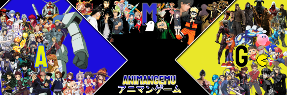
On December 9, 2021, I coined the name Animangemu, which in Japanese connects three words by taking their first parts: Anime (Ani), Manga (Mang), and Game (Gemu). What does it mean? It represents anime, manga, and video games—all together as one.
On January 24, 2022, Animangemu officially opened, though the process of completing it took basically the whole year. I didn’t really know what to do with my brand at first, and I couldn’t yet give it the iconic image you know today. Either way, month by month, Animangemu was in development. Eventually, toward the end of the year and into the beginning of the new one, I was finally able to establish Animangemu—along with its aesthetic, content, and website design. Here’s how Animangemu first looked when it was in early development.
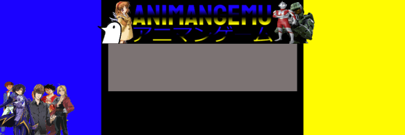
It started out as simply AMG. It meant anime, manga, and video games as the shortened abbreviation for people to recognize. The problem was that AMG is already known for being used by iconic brands like Mercedes-Benz or the AMG group on YouTube. So, I felt like I had to change it.I also added the colors blue, black, and yellow to symbolize the Akihabara aesthetic, while also using them because, well, they are my three favorite colors’ haha. Originally, I had the colors assigned to the three portals: blue for anime, black for manga, and yellow for video games. However, this was before toys & games material like TCG, board games, and live-action material like tokusatsu, adaptations, and book material like magazines, encyclopedias, and media study books became part of Animangemu. Also, the otaku culture portal had yet to be established.
Following experiment after experiment, I was eventually able to form more ideas, including this pretty cool one I made. But it was based on the Exia from Gundam 00, meaning it was under copyright protection, so I had to cancel it. Of course, it did give me a great idea for the next ones!
The logo looked really awesome, but, there was something missing? I felt like Animangemu needed both a logo, and at the same time, a symbol that everyone will recognize when my brand is mentioned.
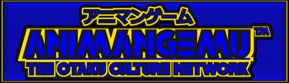
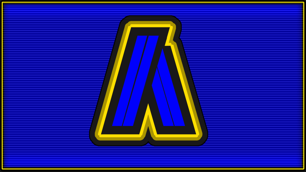
So, after months of working on my brand, I decided to give Animangemu a symbol that would make it instantly recognizable to my audience. The legendary and iconic letter A that my logo still has to this day. I chose the letter A to symbolize Animangemu’s name as a whole, while at the same time drawing inspiration from the Sony PlayStation logo. It looked so revolutionary and it was almost perfectly aligned with my vision. However, the logo itself still felt too unpolished, and it lacked the contrast I wanted to see.
In December 2022, I finally completed my dream logo. I realized that my logo needed a heavy, solid aesthetic. It needed to be the perfect design that exactly captured the Animangemu Akihabara otaku vibe I was going for, and—BAM!—my Animangemu logo was done. All I had left to do was refine the coloring, give it stronger color toning, and add a 3D feel that anyone could instantly recognize. When I finished it, it screamed perfection.
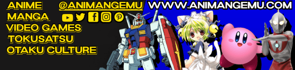
Here are some extra bonuses! This was the original banner before it was changed to the modern banner that you see today.
In January 2023, at the beginning of the new year, the completion of my website was nearly finished. That’s when I switched to a new web design for a simpler and easier way to navigate. Eventually, I wanted a logo that simply said “Animangemu” while fitting perfectly as the website logo. I finally came up with one, and after one whole year of working on it, I eventually completed it. This put a one-year journey to an end for an amazing project that, years later, is still running stronger than ever.
After that, on January 24, 2023, I published my first article during a very cold winter in Las Vegas, right from my living room. Just remembering that memory makes me feel so warm and nostalgic. It was nighttime, quiet, and, well, I had a lot to think about… I would have never thought that three years later, my brand would have grown so much—and I only have God to thank for it. It’s just hard to believe that, back when it first started, Animangemu was basically unknown to everyone. Now, people are starting to know my brand, and it has broken new ground to earn recognition. From a simple article while in Las Vegas, to now rocking it with my cosplay at anime cons in Florida… Truly amazing. I thank God for this beautiful blessing.
Also, quick trivia: originally, the slogan was going to be “Akiba-Kei in My Veins.” Then I switched to “100% Akihabara Style” to symbolize the hardcore Akiba-Kei style of my content. After that, I changed it to “Florida’s #1 Akiba-Kei” to make it a signature that my otaku brilliance comes from Florida, since that’s where my base is.
I also chose that slogan because it’s a goal of mine to become the Sunshine State’s number 1 otaku! I’M NOT KIDDING YOU!
Well, my fellow otakus, that was my three-to-four-year anniversary recap for Animangemu. I felt nothing but nostalgia and emotion just remembering all of this… At the same time, it felt a little bittersweet, but hey, time has moved on, and things are a lot better now.
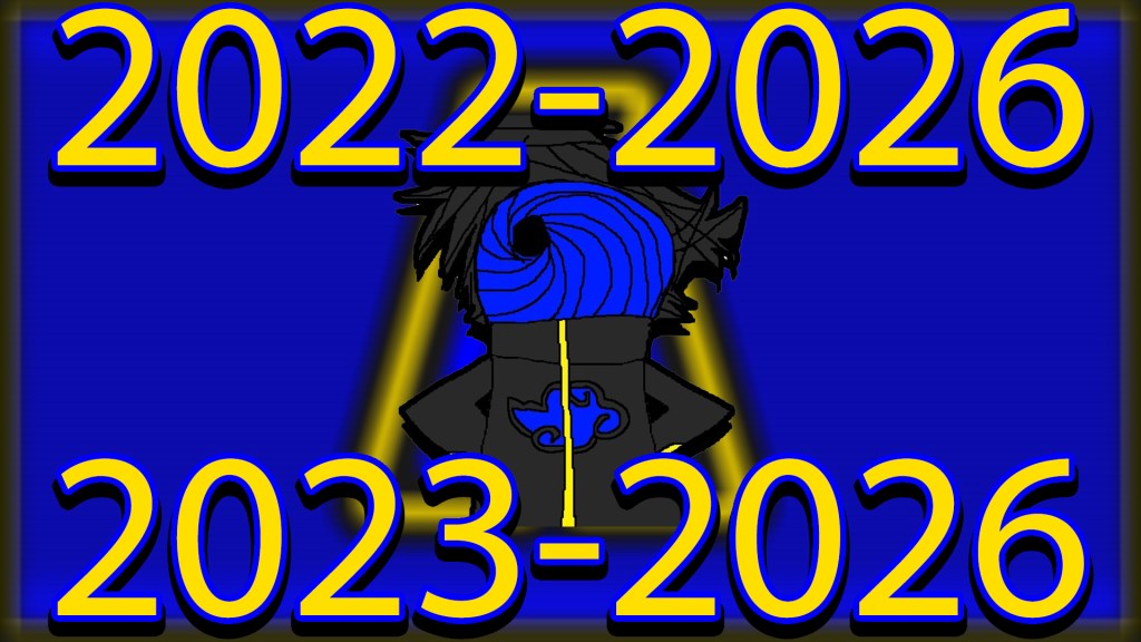
Stay tuned for this year because Animangemu is set to celebrate its fifth anniversary this December!
Also, if you have remained one of my fellow loyal viewers, then I thank you SO much and I truly appreciate you being along with me on this journey! I hope you continue to enjoy my content!
Thanks for reading!
“Florida’s #1 Akiba-Kei!”
Discover more from Animangemu
Subscribe to get the latest posts sent to your email.
